Dark mode
Dark mode is not something new. Many apps and websites allow users to switch between light and dark mode. By implementing a dark theme, you can ensure that the contrasting colors can improve visibility for visually impaired users. In addition, a dark theme also reduces power consumption for cell phones with OLED screens.
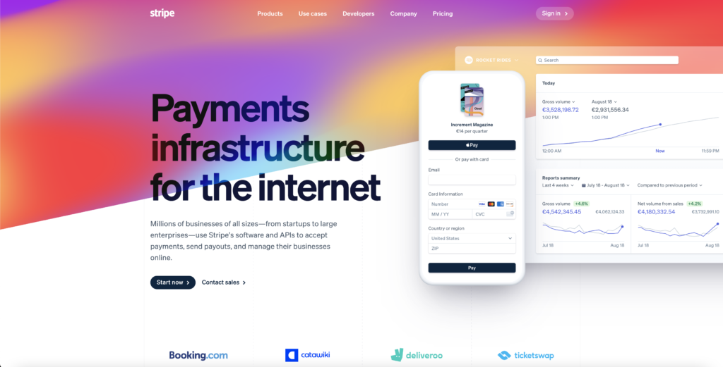
Glassmorphism and glass-inspired elements.
Glassmorphism is not a new trend, but it will persist in 2022. Better yet, this style has been around since the release of Apple’s iOS 7 in 2013. It then fell into oblivion but has resurfaced with the Mac OS Big Sur update in 2020.
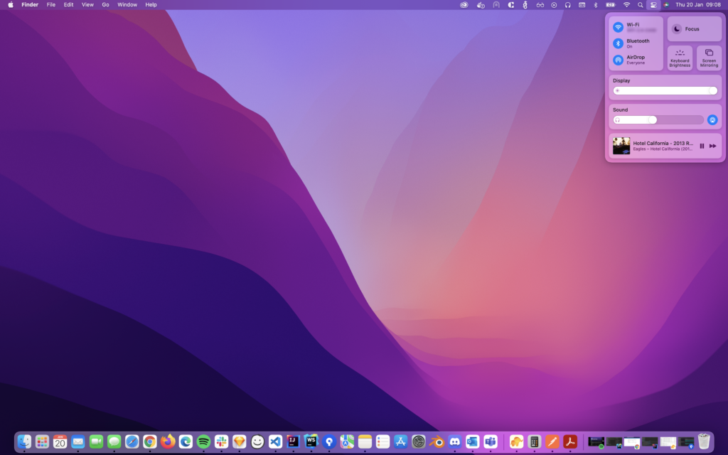
To create the “glass” effect, you can mainly play with the transparency of your object. The idea is not to make your object completely transparent, but only the fill. You can add a background blur to get a more “frosted glass” effect. Finally, you can even enhance it by adding a subtle border. When you place such an object over a light background or color gradient, you get an esthetically pleasing result. A small note: make sure that this style does not dominate your entire design. Otherwise, you will lose all the added value of this style in your design.
3D & animation
3D design and animation are used more and more in designs and interfaces. They allow you to create more hype in your interface. These elements can help users distinguish the interactive components.
3D elements and animations give the user a better idea of how to perform a certain action, but can also be used in storytelling.
In the past, it was not advisable to put many 3D elements in your interface because of the amount of data that needs to be loaded. With the rise of 5G, it will become easier and faster to load advanced elements such as 3D animations without too many delays.
Aurora Color Gradients
A trend that was already very popular in 2021 and will continue in 2022 is aurora gradients. The northern lights inspired this trend. It combines subtle, colorful, blurred colors into an organic, visually appealing whole. This gradient can be set as a background within your entire interface or highlight additional UI elements.
Moreover, you can easily combine this style with other design trends, such as glass morphism and clay morphism, blending in beautifully.
Claymorphism
A new trend for 2022 is claymorphism. At first glance, this style looks more like neumorphism, a design trend that has not been able to catch on very well. The same designs are created over and over again, which in the long run, results in a rather boring style. Another problem is that it is not always easy to implement this style in the front-end.

Within neumorphism, the design consists mainly of flat objects with some shadows to create a 3D effect. Within claymorphism, these very objects are given more volume. You can add different inner shadows to your 3D object to create a more rounded object.

Minimalism and simplification
An underrated, yet not unimportant, UI trend for 2022 is esthetic minimalism and simplification. This trend closely parallels the user experience for the user. Not everyone appreciates esthetic designs when they cannot understand your interface. A simple, well-thought-out design can also look good on its own.
Also, don’t overwhelm your users with irrelevant information such as pop-ups and notifications. For example, visitors to your website have come to you with a purpose. Try to help your visitors fulfill their purpose. Simplifying your navigation can be a big step towards completing this process successfully.
In addition, it would also help to implement time-saving features to improve the user’s journey. For example, you could observe the behavior of multiple users and determine which parts of the process could be simplified or even pre-baked.
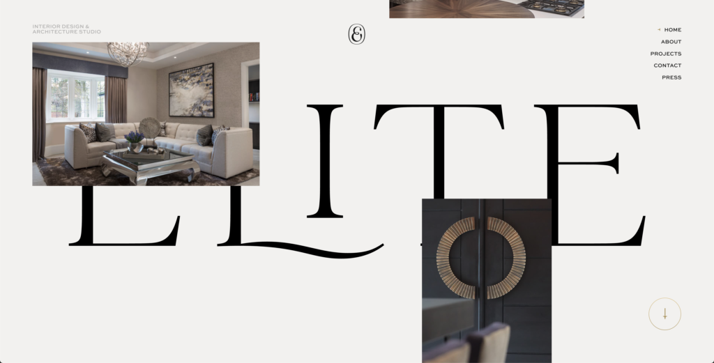
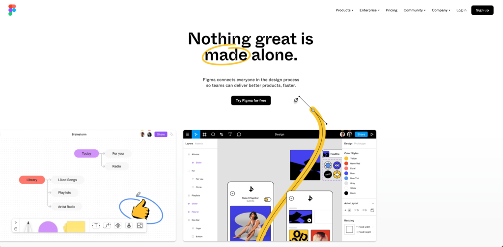
Big, bold, and experimental typography.
This year there will be even more use of big, bold titles and text in interfaces. Designers and users have become increasingly accustomed to large typography that is loud and prominent in your interface.
Whether it’s large and grotesque sans serifs or contemporary and luxurious serifs – the bigger, the better is what this trend is all about. Websites nowadays are more daring than ever to capture the attention of their audience with a careful selection of fonts.
Fascinating animations bring these typographical choices to life. Designers implement creative effects that make the typography move and interact with user mouse movement or while scrolling the page. With bold, animated, and interactive typography as the centerpiece, many websites do so without background images – for a clean and sophisticated look.